
Capital One Subscription Management
As featured on Fast Company’s Design awards
Background: Capital One is developing a suite of tools that empowers customers to manage, block, and cancel subscriptions they pay with their credit card right from the Capital One Mobile app.
Issue: Customers do not have a concrete mental model of how subscription management features fit within their banking experience.
Objective
Ideate, test, and launch a holistic subscription management experience within the Capital One Mobile app, including email and push notifications.
Strategy
Collaborate with design, product, research and tech teams to ensure content accuracy, and gauge comprehension via user testing.
Clarify the User Flow
The Total Brain Assessment contains tasks and questionnaires that aim to assess the brain’s Emotion, Feeling, Cognition, and Self Control functions. Unfortunately, the Assessment was sequenced in a manner that prioritized activity dynamism over cohesion and narrative. Users therefore found the Total Brain Assessment to have abrupt transitions, provide little to no insight into the areas of the brain that were assessed, and overly long.
I proposed that we restructure the Assessment to group tasks and questionnaires for each brain function together and to introduce an Assessment Overview screen.
This reorganization primed users to understand what to expect, including a definition of the function, its corresponding brain capacities, the number of tasks and questionnaires, a glimpse of the modules to come, and a time estimate for each module.
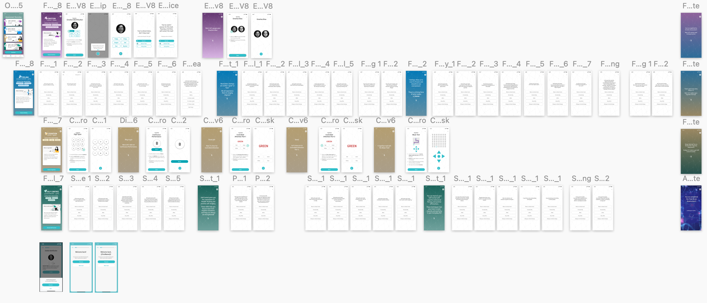
By streamlining all assessment tasks and questionnaires into separate modules, users had a clearer sense of orientation and progression.
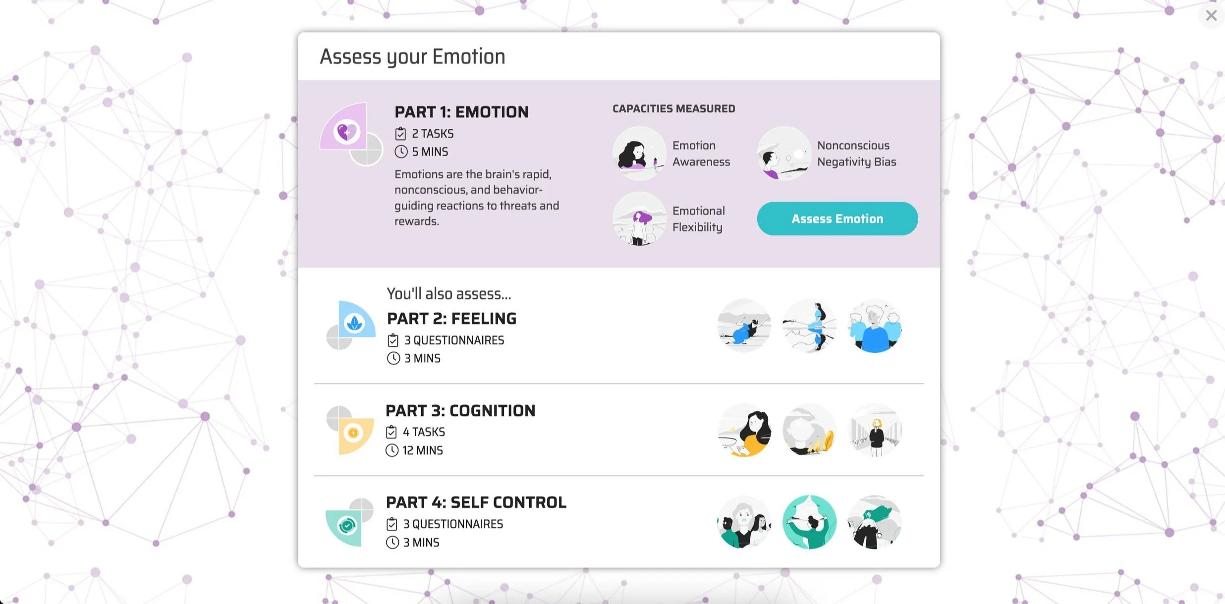
The Assessment Overview screen gave users a “checkpoint“ throughout the Assessment and primed them for what was to come.
Speak with Empathy and Encouragement
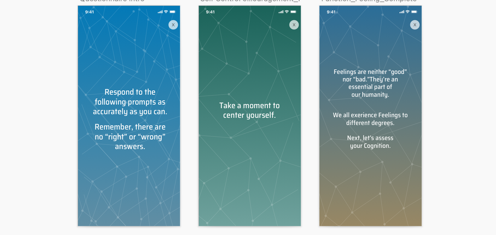
The Total Brain Assessment was not only lacking in navigational clarity — it was often mentally and emotionally taxing for users to complete everything that was asked of them with little to no feedback or insight.
I identified an area of opportunity to insert calming and insightful messages between each completed task and before each questionnaire. I then designed interstitial screens to be inserted at these points to create an experience that acknowledged progress, reassured users that their answers were valid, and reminded them to relax.
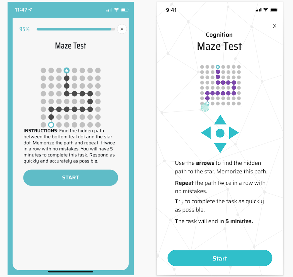
Simplify task instructions
I created a content pattern to make task instructions clear, readable, and useful by removing redundant words. breaking up paragraphs into scannable copy, and using stylized text to highlight important information. Subsequent A/B testing on Usertesting.com showed unanimous preference to and understanding of the updated text.
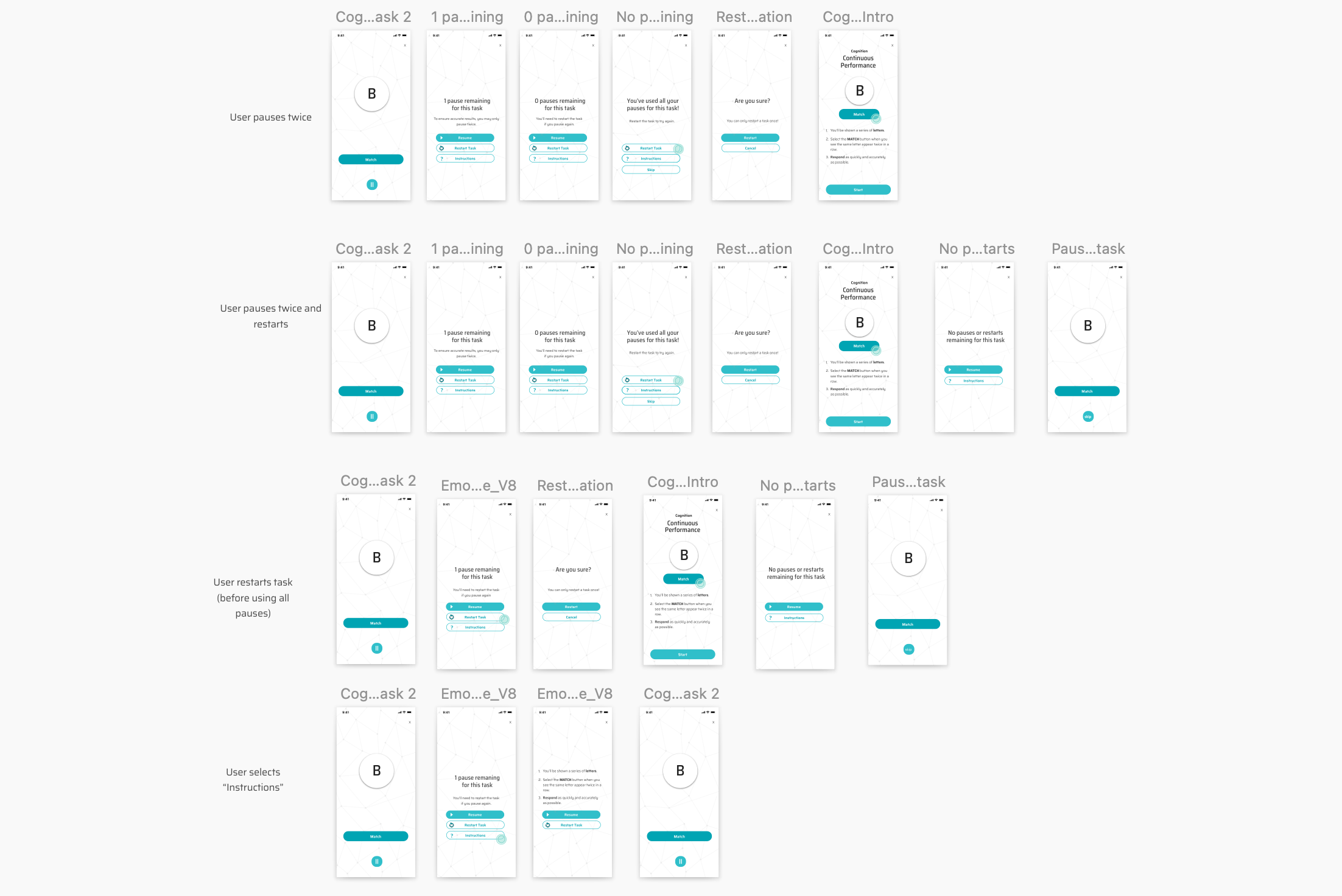
Enable pausing and Restarting
A common frustration among users was the inability to pause or restart a task, which often resulted in simply exiting the Assessment altogether or closing the app.
I collaborated with the Total Brain science team to ensure that any changes we made to the Assessment would not compromise its standardization. We ultimately concluded that while pausing and restarting could decrease exiting the Assessment, we would need to limit to 2 pauses and 1 restart per task. I then mocked up the user flows and microcopy for each of these instances.
IMPACT
A 25% monthly increase in brain assessment completion and a 30% monthly increase in assessment initiation.